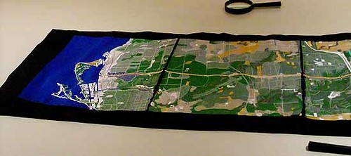
Kate McLean's SensoryMaps of Ediburgh provide not just data visualization (and excellent, witty graphic design) but a sense of what wandering the city
feels like, or more specifically, what it
smells like to roam. I first stumbled upon her
Smell Edinburgh, the Smells of Auld Reekie on a breezy day circa 2011 (
↬ edible geography).
The map shows what she smells, and data she gleaned from strangers she questioned, as she wandered the city. The smells include those ubiquitous city smells, and some specific to Edinburgh, as well as the effect of the prevailing winds. Dots show origins and lines show transmission. The article on
edible geography includes "fish and chip shops and vomit" as typical urban smells, and "the peculiar smell of the Macfarlan Smith opiate factory, the fishy pong of the penguin enclosure at the zoo, and the ammoniac stench of the boys’ toilets at South Morningside primary school are more city-specific" (along with combinations thereof!). She
writes of smell axes and her dot and contour map approach can in fact convey the location, range, direction, and intensity of smells.
She's gone on to make smell maps of Glasgow, Paris and certain "smelliest" blocks of New York city. She continues to reinvent this work. The maps of the other cities have their own designs and methodologies. The map of Glasgow (a detail):
was compiled using information from "Michael Meighan (author of "Glasgow Smells" and "Glasgow Smells Better") as well as commuters, residents, workers, tourists, the Glasgow City council."
The map of Paris was created by interacting with her audiance, and inviting them to place their connotations of her bottled scents on a map.
Her NY map is based on her own sense of smell, tipped to the blocks "smelliest" status
by an article in NY Magazine 2011 Summer Guide.
She hasn't only mapped smells. Her study of Edinburgh includes a terrifying
taste elevation map of the "Cumulative Fat Calories Injested in One (Slightly Extreme) Day of Local Eating", a
View Map of the views of landmarks and glimpsed from between gaps in other buildings as one roams the city, and a lovely embossed
Tactile map where different neighbourhoods are mapped with different idiomatic textures.
I love the idea of mapping sensory information, and it seems to me much more wholistic. It reminds me of Barry Lopez' story
The Mappist, about a cartographer with an obsessive quest to map everything in North Dakota (geology, hydrology, biology, botany, history of the place form Native times, including paths flown by Swainson's hawks, and their principle prey ground squirrels, types of soil in transparent overlays, all footpaths and their history, and so forth), or an atlas designed by Borges for his infinite library. There is something magical about this intersection of art and science, even when the subject sometimes stinks. This is, after all, part of our experience of cities, and reminds us of the importance of senses other than sight.