 |
| Oliver Byrne, geometric diagram from Euclid's Elements |
You are likely to recognize the geometrical art of Mondrian, usually in primary colours and black, space divided into variable grids with rectangles of colour, and perhaps the work of Theo van Doesburg and others in the
De Stijl (Dutch for “the style”) group. Their work, is often seen as a response to the chaos and horrors of WWI and a desire to impose order and structure by taking Cubism to its logical, geometrical extreme. "The Style" has been immensely influential on 20th century art, through other movements like Constructivism and the Bauhaus movement in art, craft and architecture. I don't just these artworks and movements as simply a rejection of chaos, but as an embrace of the tools of scientific and mathematical communication and data visualization of the 19th century.
Consider the 19th-century civil engineer and mathematician named Oliver Byrne and his well-loved 1847 edition of the foundation of geometry
Euclid’s Elements. When you look at at his diagrams with modern eyes, De Stijl is what comes to mind. His diagrams in primary colours, red, yellow and blue along with black, on a white field, his use of space all look eerily familiar, though published almost seven decades earlier.
You can see such striped down, elegant graphical design in 19th century data visualizations too. Consider this lovely diagram from the superintendent of the US census for 1870, Francis Amasa Walker, aided by colour lithographer Julius Bien, and how he displayed the data on religious observance:
 |
| Francis Amasa Walker, Ninth Census of 1870 (with colour lithographer Julius Bien), chart of religious observance |
which brings to mind not only the rectangular shapes of Mondrian but the colour field paintings of Marc Rothko and others (such as
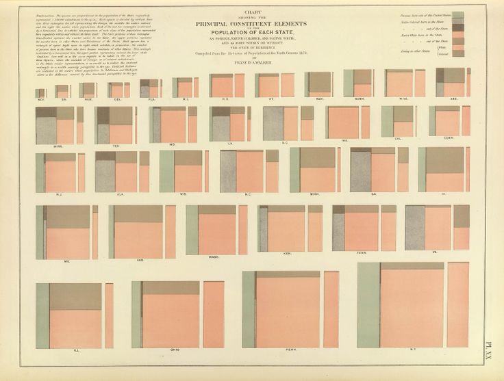
this painting by Robyn Denny from as late as 1960). Or this image of demographics by state;
 |
| Francis Amasa Walker, Ninth Census of 1870, Principle Constituent Elements of Population of Each State |
In the mid 19th century, Elizabeth Peabody made quilts with abstract visualizations of American history so she could take them on tour and discuss drivers of history with students! She designed these grid quilts for her own U.S. history textbook (1856).
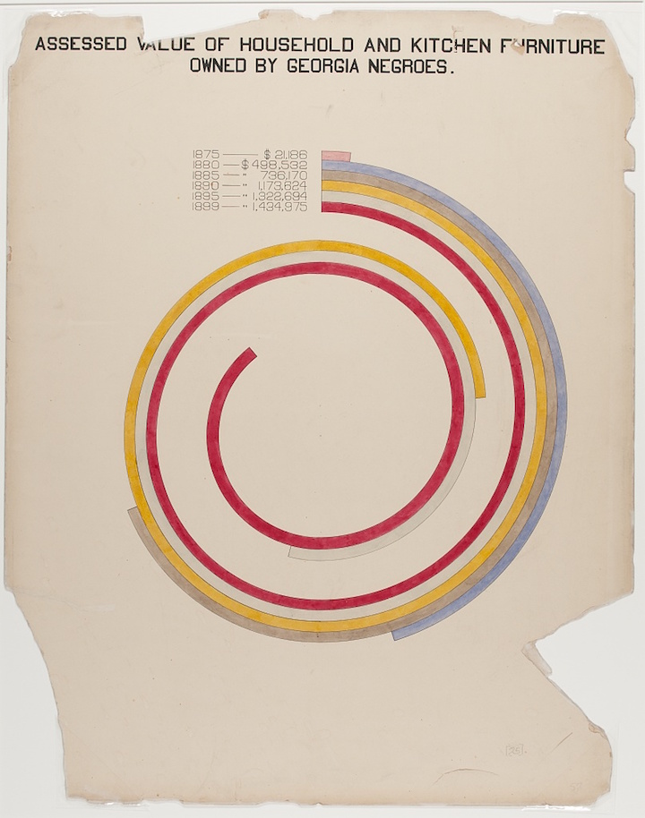
Writer, sociologist, activist and Pan-Africanist William Edward Burghardt “W. E. B.” Du Bois worked with his students in Atlanta to create beautiful, immediate and effective data visualizations of demographics and economic life in Georgia for the “Exhibit of American Negroes,” (organized by Du Bois, Thomas J. Calloway and Booker T. Washington to represent contemporary black contributions to life in the US) at the 1900
Exposition Universelle in Paris. Others have noted these images hint at the coming De Stijl movement; Alison Meier wrote in
Hyperallergic, that “they’re strikingly vibrant and modern, almost anticipating the crossing lines of Piet Mondrian or the intersecting shapes of Wassily Kandinsky”.
Data visualizations which clearly made their way into artists' hands, and in fact were often made by artists themselves, include colour charts, like these by American artist Emily Noyes Vanderpoel (1842-1939) from Color problems: A practical manual for the lay student of color.
 |
| Emily Noyes Vanderpoel (1842-1939) from Color problems: A practical manual for the lay student of color |
 |
| Emily Noyes Vanderpoel (1842-1939) from Color problems: A practical manual for the lay student of color |
But these are not dissimilar to scholarly works of analysis, not strictly aimed at artists, like this diagram:
 |
| Frontispiece to Annie Besant and Charles Leadbetter’s Thought-Forms (1905), ascribing colours to particular emotions – Source. |
To me, it does not seem a large leap from these grids of colours squares, or clean, simple geometric data visualizations to De Stijl.
 |
| Theo van Doesburg, Kleurkwadraat, 1926 |
 |
Theo van Doesburg De zaaier Design for Leaded Light Window 1921 Collection Museum Drachten.
|
 |
| A 1921 painting by Piet Mondrian |
 |
Piet Mondrian. Broadway Boogie Woogie. 1942-43
|
Or the near contemporaneous Constructivism movement in art, with monochromatic shapes "constructing" art and Suprematism with its limited palette, and geometrical shapes and lines, in Russia, and of course the Bauhaus school in Germany which cast long shadows across art, craft and architecture of the entire century.
 |
| Wassily Kandinsky, Circles in a Circle, 1923 |
 |
| Kasimir Malevich (1879-1935) |
 |
Malevich "Suprematist Composition"
|
 |
| "Walter Adolph Georg Gropius (18 May 1883 – 5 July 1969) from Bauhaus Manifesto |
See also:
Maria Popova, Mondrian Meets Euclid: An Eccentric Victorian Mathematician’s Masterwork of Art and Science
W. E. B. Du Bois’ Hand-Drawn Infographics of African-American Life (1900), The Public Domain Review


No comments:
Post a Comment