Thursday, July 18, 2013

Quantum Mechanical Art

  Richard Feynman, & Feynman diagrams,  by Hannah Wilson
Quantum mechanics is the physics of the very small, the subatomic. On that scale classical physics we know intuitively, the physics of our everyday life and human-sized things, breaks down. Strange things can happen; objects (or wave-particles at least) can go through walls or seem to go through two different French doors at the same time. We can't investigate this world without literally interfering with it. We can only know something's position or momentum precisely; it's either where or how fast, but not both. We can only meaningfully make predictions about groups of things: half of these radioactive nuclei will decay in one half-life; the electrons going through these two slits will make this specific interference pattern, but don't ask me to explain what any individual electron will do, and so forth. This sort of anti-intuitive arena inspires either purely mathematical and probabilistic or very metaphorical descriptions. Some things are unknowable, based on the fundamental laws of physics. Working in this Wonderland and believing seven impossible things before breakfast can inspire creativity and often visual thinking in physicists. This weird world within is also a source of inspiration to visual artists.

Edward Tufte, All Possible Photons
One of the most amazing and distinctly visual tools in the quantum mechanic's tool box is the Feynman diagram. These elegant schematics of lines and assorted squiggles not only depict the sorts of things which can occur in any given interaction in the quantum world, they actually allow us to calculate probabilities; they actually represent and take the place of complex equations - and believe you me are far easier to work with.  Everyone would rather draw a series of little drawings than calculate probability amplitudes by integrating over many variables. They are quite easy to read, once you know the vocabulary of particles, antiparticles, force carriers - real and virtual - and they can describe everything which can occur in the quantum world. It's perhaps no surprise that preeminent information designer and champion of elegance, simplicity and meaning in scientific graphics, Edward Tufte would be inspired to creature sculptures of Feynman diagrams with stainless steel tubing.


Richard Feynman, Equations and Sketches, 1985
Feynman himself of course had an artistic side. It is well-known that he played the bongos, or painted some of his own diagrams on his van. You may have heard his 'Ode to a flower' - a beautiful refutation of the bias that beauty is to only be found in art, and it is lost on science. The short monologue is animated by Fraser Davison below.  He himself started to draw, at age 44, shortly after developing his visual language for quantum mechanics (via Brain Pickings). He traded art for science lessons with his friend the doubter that scientists could see the beauty of a flower. His daughter Michelle even gathered his drawings into a short book The Art of Richard P. Feynman: Images by a Curious Character. 


Richard Feynman - Ode To A Flower from Fraser Davidson on Vimeo.

Oliver Jeffers, 'Still life with light and lightbulb'
Painter and illustrator Oliver Jeffers got inspired by quantum mechanics, and wave-particle duality. As he himself explains below, we find that if you set up and experiment to look for a wave, light (and in fact electrons, or other quantum wave/particles) will behave like a wave; whereas, if you set up an experiment to look for a particle light (and other wavicles) will behave like a particle.  His painting 'Still life with light and lightbulb' includes the de Broglie equation, relating wavelength to momentum of anything! (So particles, with mass and momentum have wavelengths, and photons which can seem like waves have momentum like particles).


Julian Voss-Andreae, The Well (Quantum Corral), 2009
Gilded wood, 3” x 13” x 12” x (6 x 34 x 31 cm)
Julian Voss-Andreae is a sculptor who also pursued graduate research in quantum mechanics. His background comes out in his sculptures of 'Quantum Objects' and molecular structures. A quantum coral is  a a ring of atoms arranged in an arbitrary shape on a substrate. Lutz, Eigler and Crommie (1993), for instance used a ring of iron (which is ferromagnetic) atoms on copper to reflect the surface electrons into a predicted wave pattern - 'coralling' them into the 'fence' of iron. Voss-Andreae used their specific data to create his sculpture The Well (as in a quantum mechanical well or potential energy well in which electrons are trapped). Like any wavicle, the nature of his 'Quantum Man' sculpture depends on how you look at it, appearing quite solid or nearly disappearing altogether. He also makes beautiful sculptures of structures right at the classic/quantum interface... where the weird world of the very small gets to sufficiently large molecular structures to obey the physics of our everyday world, like 'Quantum Buckeyball' and the many complex protein molecules. His graduate work incidentally, showed that single object as large as Carbon-60, a Buckyball, would behave like a wave, going through two slits at once (just like electrons in the famous double slit experiment).

Julian Voss-Andreae, Quantum Man


Julian Voss-Andreae, Quantum Buckeyball

Niels Bohr portrait 4
Ele Willoughby, Niels Bohr, 2010
My own artwork on the subject of quantum mechanics is a little less literal perhaps... though my linocut portrait of Niels Bohr includes the Bohr model explanation of the Balmer series - the spectral lines given off by excited hydrogen which are in the visible range, showing Bohr's electron orbits (which we now know are a bit too simplistic a model) at the right ratio of diameters, and photons (shown as wavy lines, following Feynman's convention) given off as an electron falls from one given orbit to another lower energy state in the appropriate colours. The line spectrum you would see, if you spread the light given off with a prism, is shown below. I've also depicted Schrödinger's cat, one of the most famous thought experiments (or, really metaphors for the weirdness of quantum mechanics). Erwin Schrödinger proposed this hypothetical experiment to link the strangeness of the quantum world to our everyday world of big things like cats. He imagined a cat in a box with a vial of lethal poison which would rupture if and only if a radioactive particle had decayed - an individually unpredictable quantum event. Until you open the box, is the cat dead or alive? According to quantum mechanics, the wavefunction (or equation describing its state) is the superposition of that of dead and live cat... that is, equal parts live and dead... which of course, seems absurd. Whether the cat is alive or dead depends on when you look at it. Hence, I made a cat and poison vial in thermochromic temperature-dependant ink; sometimes they are apparent, sometimes they are not (or at least, it's too warm and they turn colourless).

Schroedinger1
Ele Willoughby, Schrödinger's Cat (coloured state), 2011

Schroedinger's cat isn't there
Ele Willoughby, Schrödinger's Cat (colourless state)


Thursday, July 4, 2013

The Paleobet

Rosemary Mosco of bird and moon describes herself as a nature lover with with a passion for science communication. She has a truely marvellous collection of illustrations and comics. You should check them out. As a fan of alphabets and prehistoric creatures, I can't resist sharing the Paleobet.


Sunday, June 30, 2013

Textile Maps

Map art is one of my favorite things. I'm always gathering examples. I define it broadly to include any art map with maps, or of maps, artistic cartography, and the art of what is mappable. Today, I'm sharing a subset of what I've found: the maps made with textiles (especially map quilts and embroidery).

Haptic Lab, Great Lakes quilt

Haptic Lab, Paris quilt
Haptic Lab makea variety of wonderful quilt maps and kits so you can make your own. I think of the Great Lakes as home (though as a Canadian, I think they are missing the boat by only annotating the American side).

They've also made some lovely city map quilts and kits, including the ones for Paris and Boston, shown.


Former urban planner, Kathryn Clark made a series of 'foreclosure quilts' depicting bird's eye views of neighbourhoods with the foreclosed properties marked. She writes, "It was important to me to present the whole story in a way that would captivate people’s attention and make a memorable statement. Making map quilts seemed an ironic solution. Quilts act as a functional memory, an historical record of difficult times.  It is during times of hardship that people have traditionally made quilts, often resorting to scraps of cloth when so poor they could not afford to waste a single thread of fabric."

Kathryn Clark, Detroit Foreclosure Quilt, 22" x 44" Cheesecloth, linen, cotton and quilting thread.
Kathryn Clark, Cleveland Foreclosure Quilt, 2011. 25" x 60" Cotton, linen, recycled denim and embroidery thread. 

Kahryn Clark, Chicago Foreclosure Quilt, 2013. 31" x 42" Linen, cotton and embroidery thread.

Leah Evans uses appliqué, reverse appliqué, piecing, natural and synthetic dyeing, needle-felting, hand printing, and a variety of embroidery stitches to make her quilts, based on aerial photography, maps, and satellite imagery, though they may not be consciously based on specific places. The results are organic and beautiful.

Leah Evans, Estuary

Leah Evans, Development

Leah Evans, Isthmus Nocturn

Leah Evans, Tundra

See also Ian Hundley and his fabric map quilts.

Ian Hundley and his fabric map quilts

As described previously, Steele and Tomczak created Street of Heaven, a stitched, embroidered map of Toronto and specifically, Yonge STreet for STITCHES.

yonge_st 
Steele and Tomczak, Street of Heaven 

Other amazing examples I've found of embroidered maps include:


IÑIY SANCHEZ’S SUSTAINABLE EARTH SWEATER

Nicola Searle, Memory map of a route in my hometown, St. Albans.

Heidi Weiss
Flood Map (October 19-23, 2009), cotton thread on linen. 7" x 11"

Embroidered Buenos Aires map for travel guide cover. By Rita Smirna.

Tuesday, June 25, 2013

Fibre Art Specimens

Sometimes the artifacts of science are beautiful in and of themselves. This is of course true of most biological specimens, as lifeforms themselves are beautiful. Thus you do see them recreated in various media. Today I bring you textile art specimens. Be sure to also see previous magpie & whiskeyjack posts Naturalia & Mirabilia on the art of Lyndie Dourthe, Barnacles which includes crocheted marine creatures like the Hyperbolic Crochet Coral Reef, Felt & Food Geology about the photos of Eszter Burghardt, and Doily Science on Lisa Solomon's anatomical and chemical doilies.

Laura Splan's microbial doilies "explores the 'domestication' of microbial and biomedical imagery. Many recent events, epidemics, and commercial products have brought this imagery into our living rooms, kitchens, and bathrooms," by employing this old-fashioned, domestic medium.


all by Laura Splan, 2004
freestanding computerized machine embroidered lace mounted on velvet
16.75H x 16.75W inches each (framed dimensions)
(via she walks softly)

Her 2002 'Vigilant' show also featured hand latch-hooked yarn on stretched latch-hook canvas images of petri dishes of various microbes.


Laura Splan, Vigilant, 2002, hand latch-hooked yarn on stretched latch-hook canvas, 120H x 204W inches (installation dimensions variable)

I've mentioned Australian artist Helle Jorgensen previously (for her crocheted Barnacles) but her plastic crochet sea creatures are worth exploring again.

Helle Jorgensen, 'Diploria'

Helle Jorgensen, 'Medusa'

Helle Jorgensen, 'The Retail Reef'

Laura Katherine McMillan's fibre art Petri dishes are quite lovely.

Laura Katherine McMillan, Cell series

Jessica Polka has made some wonderful fibre art specimens, from sea creatures to mushrooms (and she sells crochet patterns through her Etsy shop, which she describes as a wunderkammer, much to my delight).


Jessica Polka, chiton anatomy

Jessica Polka, mollusk anatomy

Jessica Polka, scaphopod anatomy

(you should also check out her laser-cut Turing patterns and her blog in general!)

Aubrey Longley-Cook's embroidered animals include their skeletons. See more on his blog spool spectrum.

Aubrey Longley-Cook

Amongst other work, Andrea V. Uravitch has made small insects and bugs from embroidered and sewn fabric and wire.

Andrea V. Uravitch

Andrea V. Uravitch


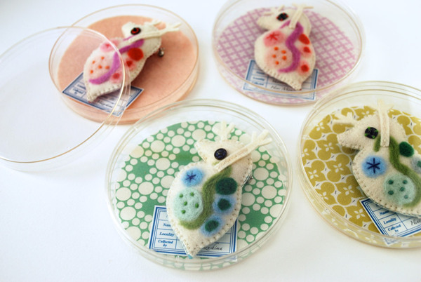
Hiné Mizushima makes wonderful and whimsical needle felted sculptures, including a variety of biological specimen.


Hiné Mizushima, Giant Daphnia brooches

Hiné Mizushima


Thursday, June 20, 2013

Astrophysical Meme: Jocelyn Bell Burnell's Pulsar, Little Green Men, Joy Division, and Beautiful Data

In November, 1967, Jocelyn Bell (Burnell) was just a graduate student when she discovered the first radio pulsar (or pulsating star), a highly magnetized, rotating neutron star that emits a beam of electromagnetic radiation. This radiation (light in the radio frequency band) can only be observed when the star is point towards us; so, like the light from a distant lighthouse, it appears to pulse at a precise frequency. She had been working with her supervisor Antony Hewish and others to construct a radio telescope to study quasars (quasi-stellar objects which emit radio waves). She noted some "scruff" on her chart-recorder, and then that the pulses were incredibly regular, occurring every 1.337 seconds. Hewish was initially scornful and insisted the regular pulses must be noise from a human made source. He first dubbed this object, emitting with such regularity 'LGM 1' for "Little Green Men 1", a playful joke about their uncertainty about what could emit radiation so regularly - obviously it could only be a communication from extraterrestrials hahaha! Only after she found other such sources, in different places with different frequencies, were her colleagues convinced and this lead to the development of the pulsar model. It is now known PSR B1919+21.

The 1968 paper announcing this discovery in Nature has five authors, lead by Hewish, followed by Jocelyn Bell. In 1974, Hewish won the Nobel Prize for this discovery, along with fellow radioastronomer Marlin Ryle). Jocelyn Bell was not included as it was assumed that the "senior man" was responsible for the work. This was controversial and has been condemned by many leading astronomers like Fred Hoyle )(who with Thomas Gold was first able to explain the signals as due to a rapidly rotating neutron star). Jocelyn Bell Burnell herself has stated she was not upset. Bell Burnell has a great career and won many honours after her impressive start, but her exclusion from the Nobel win, based on her own research strikes me and many others as one of the more blatant and egregious examples of gender bias in the selection of Nobel prize recipients.

Not only the discovery, but the presentation of the data is impressive and elegant. The diagram above (from the Cambridge Encyclopaedia of Astronomy) shows superimposed images of successive pulses. Stripped down to their essential information like sparklines (chart lines without annotation or axes, but drawn of course to a common scale) so their regularity really stands out, and they can be easily compared and contrasted. If you are used to looking at time series, you'll know that since they can be easily superimposed and the pulses line up, that the frequency is quite regular. The diagram is downright eloquent, and would warm Edward Tufte's heart. It appeared even earlier in the January 1971 edition of Scientific American article “The Nature of Pulsars” by Jeramiah P. Ostriker (shown above on pale blue) and 1974 graphic design book on data visualisation ‘Graphis Diagrams’(via Gia's Blog).

From there, the image began a sort of life of its own. The British rock band Joy Division included the image from the Cambridge Encyclopaedia of Astronomy in a folder of reference material for their 1979 album Unknown Pleasures submitted to Peter Saville, who designed the album cover- iconic in white on black, it's the pulsar data graphically on a square field (at left). It of course appeared as art, without explanation of its source. The beauty of the image itself, as well as the devotion of fans of the enigmatic album, lead to it propagating as a meme to this day. Peter Saville himself gives a great explanation of the life of this diagram in this video.


Data Visualization Reinterpreted by VISUALIZED from VISUALIZED on Vimeo.

Consider how the image has propagated, from tattoos
via Gia's Blog and tattoo by dodie

to sculpture
[unkn0wn pleaSures 1919] by Marvin Bratke, Lasercut Sculpture 40x40cm, wood/acrylic glass

to food
Brock Davis

through fashion (both consciously of its original source, and more tongue-in-check critique of our contemporary cult of images disconnected from their source - though ironically, I'm pretty sure the tee shirt was designed by someone who thought kids today should know Unknown Pleasures, rather than radioastronomy).

PULSAR 1919 SKIRT by lovelysally

Graphic artist Adam J. Kurtz has created this humorous t-shirt via laughing squid

We've arrived at something interesting to look at on tumblr, without reference to Joy Division or pulsars, an enigmatic but captivating image with an unknown source... an unknown pleasure if you will.


LinkWithin

Related Posts with Thumbnails