Showing posts with label data visualization. Show all posts

Friday, February 9, 2018

19th Century Diagrams and Infographics to De Stijl, Constructivism and Bauhaus

Oliver Byrne, geometric diagram from Euclid's Elements
You are likely to recognize the geometrical art of Mondrian, usually in primary colours and black, space divided into variable grids with rectangles of colour, and perhaps the work of Theo van Doesburg and others in the De Stijl (Dutch for “the style”) group. Their work, is often seen as a response to the chaos and horrors of WWI and a desire to impose order and structure by taking Cubism to its logical, geometrical extreme. "The Style" has been immensely influential on 20th century art, through other movements like Constructivism and the Bauhaus movement in art, craft and architecture. I don't just these artworks and movements as simply a rejection of chaos, but as an embrace of the tools of scientific and mathematical communication and data visualization of the 19th century.

Consider the 19th-century civil engineer and mathematician named Oliver Byrne and his well-loved 1847 edition of the foundation of geometry Euclid’s Elements. When you look at at his diagrams with modern eyes, De Stijl is what comes to mind. His diagrams in primary colours, red, yellow and blue along with black, on a white field, his use of space all look eerily familiar, though published almost seven decades earlier.


Oliver Byrne from The First Six Books of the Elements of Euclid (public library)


Oliver Byrne from The First Six Books of the Elements of Euclid


Oliver Byrne from The First Six Books of the Elements of Euclid

You can see such striped down, elegant graphical design in 19th century data visualizations too. Consider this lovely diagram from  the superintendent of the US census for 1870, Francis Amasa Walker, aided by colour lithographer Julius Bien, and how he displayed the data on religious observance:

Francis Amasa Walker, Ninth Census of 1870 (with colour lithographer Julius Bien), chart of religious observance
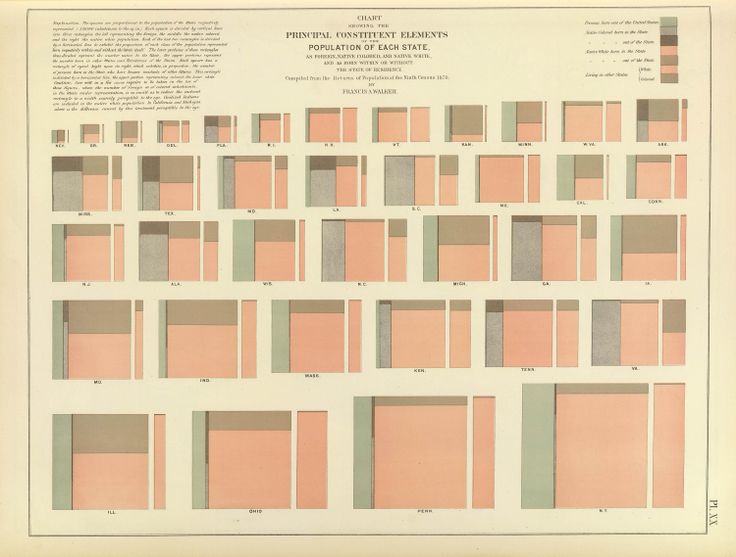
which brings to mind not only the rectangular shapes of Mondrian but the colour field paintings of Marc Rothko and others (such as this painting by Robyn Denny from as late as 1960). Or this image of demographics by state;

Francis Amasa Walker, Ninth Census of 1870, Principle Constituent Elements of Population of Each State
In the mid 19th century, Elizabeth Peabody made quilts with abstract visualizations of American history so she could take them on tour and discuss drivers of history with students! She designed these grid quilts for her own U.S. history textbook (1856).


Elizabeth Peabody, historical visualizations quilt (1856 - Image by the Digital Humanities Lab at Georgia Tech)


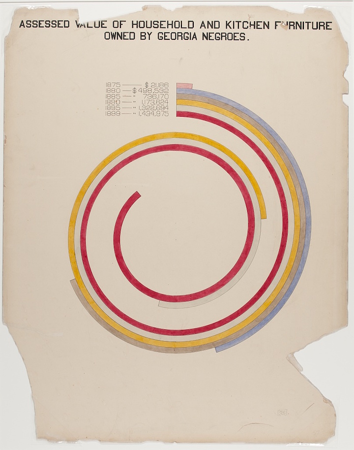
Writer, sociologist, activist and Pan-Africanist William Edward Burghardt “W. E. B.” Du Bois worked with his students in Atlanta to create beautiful, immediate and effective data visualizations of demographics and economic life in Georgia for the “Exhibit of American Negroes,” (organized by  Du Bois, Thomas J. Calloway and Booker T. Washington to represent contemporary black contributions to life in the US) at the 1900 Exposition Universelle in Paris. Others have noted these images hint at the coming De Stijl movement; Alison Meier wrote in Hyperallergic, that “they’re strikingly vibrant and modern, almost anticipating the crossing lines of Piet Mondrian or the intersecting shapes of Wassily Kandinsky”.

W. E. B. Du Bois' data visualizations for the assembled for the 1900 Paris Exposition

W. E. B. Du Bois' data visualizations for the assembled for the 1900 Paris Exposition

W. E. B. Du Bois' data visualizations for the assembled for the 1900 Paris Exposition

W. E. B. Du Bois' data visualizations for the assembled for the 1900 Paris Exposition

Data visualizations which clearly made their way into artists' hands, and in fact were often made by artists themselves, include colour charts, like these by American artist Emily Noyes Vanderpoel (1842-1939) from Color problems: A practical manual for the lay student of color.


 But these are not dissimilar to scholarly works of analysis, not strictly aimed at artists, like this diagram:
Frontispiece to Annie Besant and Charles Leadbetter’s Thought-Forms (1905), ascribing colours to particular emotions – Source.

To me, it does not seem a large leap from these grids of colours squares, or clean, simple geometric data visualizations to De Stijl.

Theo van Doesburg, Kleurkwadraat, 1926

Theo van Doesburg De zaaier Design for Leaded Light Window 1921 Collection Museum Drachten.

A 1921 painting by Piet Mondrian

Piet Mondrian. Broadway Boogie Woogie. 1942-43

Or the near contemporaneous Constructivism movement in art, with monochromatic shapes "constructing" art and Suprematism with its limited palette, and geometrical shapes and lines, in Russia, and of course the Bauhaus school in Germany which cast long shadows across art, craft and architecture of the entire century.

Wassily Kandinsky, Circles in a Circle, 1923

Kasimir Malevich (1879-1935)

Malevich "Suprematist Composition"

"Walter Adolph Georg Gropius (18 May 1883 – 5 July 1969) from Bauhaus Manifesto

Sophie Taeuber-Arp, Composition, 1937


See also:

Maria Popova, Mondrian Meets Euclid: An Eccentric Victorian Mathematician’s Masterwork of Art and Science
  
W. E. B. Du Bois’ Hand-Drawn Infographics of African-American Life (1900), The Public Domain Review 

Allison Meier, W. E. B. Du Bois’s Modernist Data Visualizations of Black Life,  Hyperallergic,  July 4, 2016 

Library of Congress collection W. E. B. Du Bois' data visulizations for the assembled for the 1900 Paris Exposition 

Susan Schulten, 11 Of The Most Influential Infographics Of The 19th Century September 25, 2012

Jason Diamond,  Colorful Victorian-Era Illustratons for Euclid’s ‘Elements’

The Shape of History: Reimagine 19th Century Data Visualization” by Lauren Klein at Columbia University

 also, don't miss Helen Friel's 3D paper sculptures of Oliver Byrne's diagrams


Wednesday, July 15, 2015

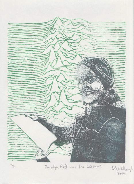
Jocelyn Bell Burnell and the LGM-1

Jocelyn Bell and the LGM-1
Jocelyn Bell and the LGM-1, linocut portrait by Ele Willoughby 2014

Happy birthday to astrophysicist Jocelyn Bell Burrell (born, 1943), who discovered pulsars! As I wrote previously:

In November, 1967, Jocelyn Bell (Burnell) was just a graduate student when she discovered the first radio pulsar (or pulsating star), a highly magnetized, rotating neutron star that emits a beam of electromagnetic radiation. This radiation (light in the radio frequency band) can only be observed when the star is point towards us; so, like the light from a distant lighthouse, it appears to pulse at a precise frequency. She had been working with her supervisor Antony Hewish and others to construct a radio telescope to study quasars (quasi-stellar objects which emit radio waves). She noted some "scruff" on her chart-recorder, and then that the pulses were incredibly regular, occurring every 1.337 seconds. Hewish was initially scornful and insisted the regular pulses must be noise from a human made source. He first dubbed this object, emitting with such regularity 'LGM 1' for "Little Green Men 1", a playful joke about their uncertainty about what could emit radiation so regularly - obviously it could only be a communication from extraterrestrials hahaha! Only after she found other such sources, in different places with different frequencies, were her colleagues convinced and this lead to the development of the pulsar model. It is now known PSR B1919+21.

The 1968 paper announcing this discovery in Nature has five authors, lead by Hewish, followed by Jocelyn Bell. In 1974, Hewish won the Nobel Prize for this discovery, along with fellow radioastronomer Marlin Ryle). Jocelyn Bell was not included as it was assumed that the "senior man" was responsible for the work. This was controversial and has been condemned by many leading astronomers like Fred Hoyle (who with Thomas Gold was first able to explain the signals as due to a rapidly rotating neutron star). Jocelyn Bell Burnell herself has stated she was not upset. Bell Burnell has a great on-going career and won many honours after her impressive start, but her exclusion from the Nobel win, based on her own research strikes me and many others as one of the more blatant and egregious examples of gender bias in the selection of Nobel prize recipients.

Read the full post about how her beautiful dataset itself has lead a life of its own as a cultural meme.

Tuesday, May 12, 2015

Florence Nightingale; Nursing, Statistics and Data Visualization Pioneer

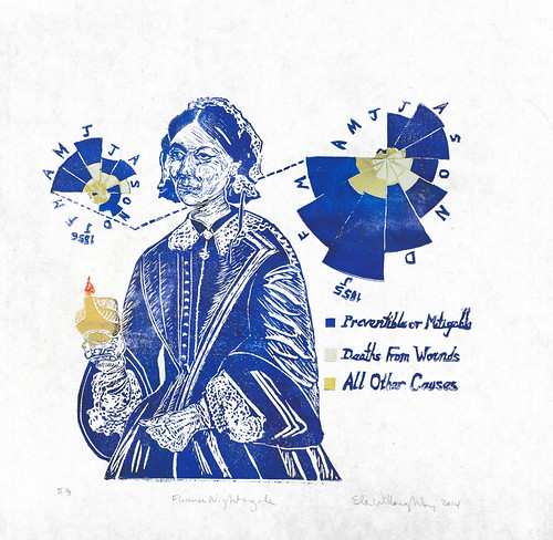
Florence Nightingale portrait
Florence Nightingale, 2nd edition linocut on kozo, Ele Willoughby, 2014

I confess that Florence Nightingale (12 May 1820 – 13 August 1910) wasn't on my shortlist of women in science I wished to portray. I felt a little like she was an old-fashioned heroine, from a time where if a woman wasn't going to be defined strictly as a person who served and cared for her family, it was okay if (and only if) she cared for other people. This bias was somewhat reinforced by my own family history: my mother is a nurse, her mother was a nurse, whereas I am a physicist. I know my grandmother wanted to be a pharmacist, and my mother felt her career options were school teacher or nurse. Plus, I take after my father's side of the family and have been known to have a vasovagal response to the mere description of medical procedures; I have a high pain threshold, but am squeemish, and faint like the rest of them. All of which means I partially define myself by not being a nurse. However, I was (luckily) commissioned to make a portrait of Florence Nightingale. The more I read, the more interesting she became to me.

Nightingale earned the nickname "The Lady with the Lamp" during the Crimean War, from a phrase used by The Times, describing her as a “ministering angel” making her solitary rounds of the hospital at night with “a little lamp in her hand”. The image was immortalized by Henry Wadsworth Longfellow's 1857 poem Santa Filomena in the stanza:


Lo! in that house of misery
A lady with a lamp I see
Pass through the glimmering gloom,
And flit from room to room.

So, I’ve shown Nightingale with her little lamp, based on contemporary photos and illustrations. But inventing modern nursing wasn't her only accomplishment. Taking up a profession, travelling to a war zone, nursing the wounded, taking on hospital administration and the training of a professional class of nurses weren't the only things she did which were so unusual for a woman of her time to do. It turns out that her father fostered her gift for mathematics, and she made significant contributions to statistics and data visualization too.

Behind Nightingale is her own ‘Diagram of Causes of Mortality in the Army in the East’ plotted as a polar area diagram – her own statistical and data visualization innovation, sometimes called a Nightingale Rose Diagram. It illustrates the causes of death in the military hospital she managed during the Crimean War. April 1855 to March 1856 is shown on the left and April 1854 to March 1855 to the right. When she researched the causes of mortality, looking back at the data, she saw clearly that the lack of hygiene was a far greater risk to soldiers’ lives than being wounded. The sections represent one month of data {J,F,M,A,M, J,J,A,S,O,N,D} for each month of the year. The green “wedges measured from the centre of the circle represent area for area the deaths from Preventible or Mitigable Zymotic diseases, the [yellow] wedges measured from the centre the deaths from wounds, & the [orange] wedges measured from the centre the deaths from all other causes. The […] line across the [yellow] triangle in Nov. 1854 marks the boundary of the deaths from all other causes during the month. In October 1854, & April 1855, the [orange] area coincides with the [yellow], in January & February 1856, the [green] coincides with the [orange]. The entire areas may be compared by following the [green], the [yellow], & the […] lines enclosing them.” This "Diagram of the causes of mortality in the army in the East" was published in Notes on Matters Affecting the Health, Efficiency, and Hospital Administration of the British Army and sent to Queen Victoria in 1858.

This experience influenced her later career and she campaigned for sanitary living conditions, knowing how dangerous unsanitary conditions can be to survival. She also made extensive use of similar polar area diagrams on the nature and magnitude of the conditions of medical care in the Crimean War, or sanitation conditions of the British army in rural India, to make such statistics transparent to Members of Parliament and civil servants who would have been unlikely to read or understand traditional statistical reports. This is an excellent example of how careful selection of how data is presented can influence whether the information is successfully communicated and how important that can be - occassionally even influencing people's survival!

In 1859, Nightingale was elected the first female member of the Royal Statistical Society. She later became an honorary member of the American Statistical Association.

Though her own opinion  of other women was often harsh, she has been credited with contributing to feminist literature with a book she wrote while sorting out her thoughts on her role in the world, including the essay Cassandra, which protested the over-feminisation of women into near helplessness. She helped abolish laws regulating prostitution that were overly harsh to women. She also clearly expanded the acceptable forms of female participation in the workforce.

This, and in particularly, the way she insisted on making decisions based on scientific evidence, and using data to save lives, makes her an apt addition to the women in science portrait series.

Sunday, March 13, 2011

Visualizing Hairballs & Beauty in Excess

I'm sorry to have neglected this blog of late. I've been busy with a number of things, so I thought I'd bring you a metaphorical miscellany of things which have been occupying my mind. One of the things that has been taking my time has been working on visualization of scientific data. The intersection of art and scienc being close to my heart, I attended a workshop with scientists, graphic designers, journalists and other communicators, and as such have been thinking about new ways of visualizing both for understanding and for explaing results. Complex networks of data are known as 'hairballs' (for, I think, obvious reasons). There are a number of oper-source packages for dealing with plotting and representing such monsters. Many of these programs are Python-based. As a result, I've been trying to teach myself some Python. I found this data visualization of the history of the code I'm trying to learn so I can make more exciting and effective visualizations an ironic thing to stumble upon. It's also quite pretty with all the overlapping, translucent layers:

code_swarm - Python from Michael Ogawa on Vimeo.


(via bioephemera)

Check out similar visualizations at code swarm "an experiment in organic software visualization."

Speaking of layers of overlapping, translucent layers, I found this "Photo Opportunities" project by Swiss artist Corinne Vionnet quite beautiful. She found and combined hundreds of perhaps cliché tourist photos of famous locations and layered them to create something impressionistic and beautiful:


Swiss-based architect and programmer Michael Hansmey employs algrithms as design tools. In 'Subdivision: Ornamented Columns' he used iterative subdivision as a means of creating elaborately ornamented columns with millions of facets, beginning with an ideal Doric column. The layers are laser-cut from 1mm sheet to create these 2.7 m glorious columns. Read about his process here. I just imagine what Gaudí would do with such technology at his disposal.


(I saw this in a couple of places - most recently via Thersic.)

LinkWithin

Related Posts with Thumbnails